Transforming the Sign-Up Flow

Redesigned NerdWallet’s registration into a streamlined three-screen flow — boosting conversion by 5.5% and increasing brand recognition from 33% to 75%.
ROLE
User research
Usability & A/B testing
Product design
TOOLS
Figma
UsabilityHub
PostHog
TIMELINE
Jun - Aug 2022
Making Sign-Up Less of a Hurdle
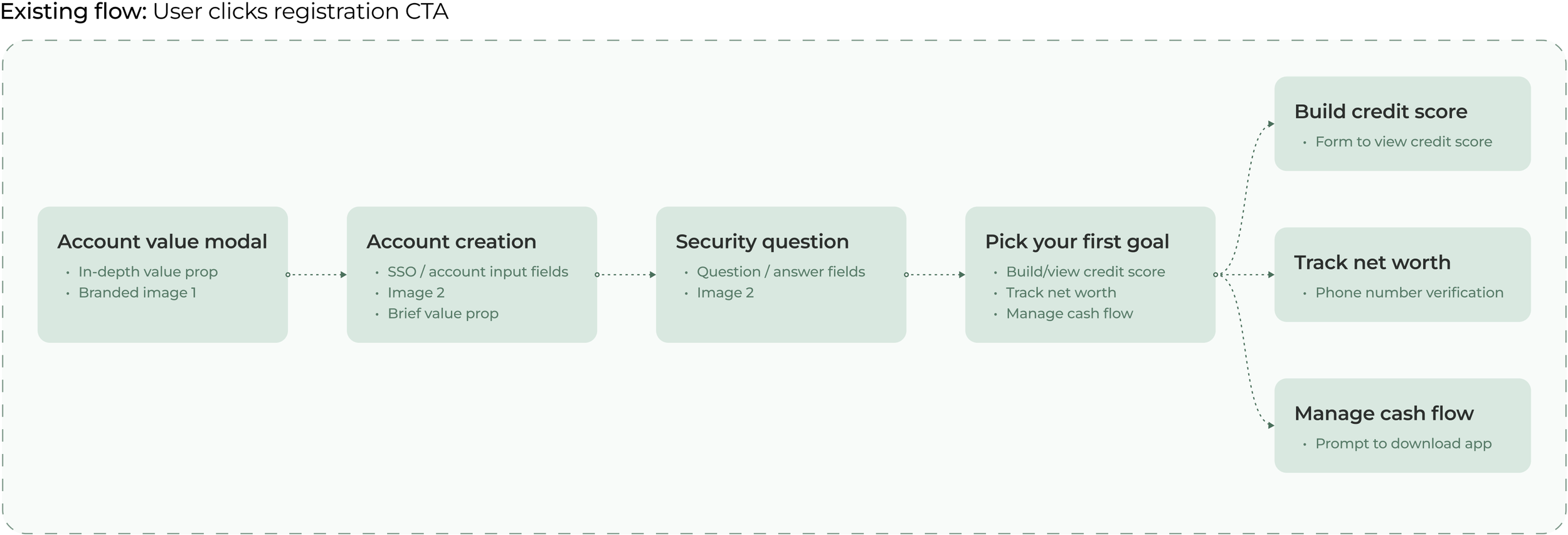
NerdWallet is known for helping people make better financial decisions, yet its registration process had grown to 5+ steps - frustrating users and hurting conversions. Based on my research findings, I set out to improve conversion rates by enabling users to sign up quickly and immediately grasp the value of a NerdWallet account.
Pinpointing the Roadblocks
50-PERSON BRAND RECALL TEST
Only 36% recognized “NerdWallet” in a five-second recall study, revealing weak brand presence early on.
12 IN-DEPTH USER INTERVIEWS
66% of participants felt unsure why they should create an account or what they’d gain.

WEBSITE ANALYTICS
54.5% drop-off occurred after Screen 3, indicating the flow felt too long for many users.

Outlining Key Priorities
After gathering these insights, I realized the registration process was too long and lacked immediate clarity on NerdWallet’s value. I set three specific objectives:
1.
Cap the registration flow at three steps, directly addressing the drop-off at Screen 3.
SHORTEN THE FLOW
2.
Users need to immediately understand how creating an account benefits them.
HIGHLIGHT KEY BENEFITS
3.
Integrate NerdWallet’s logo, colors, and typography to improve brand recognition.
STRENGTHEN BRANDING
Ideation & Early Feedback
I created several low-fidelity designs to explore ways of reducing drop-off and highlighting NerdWallet’s value proposition. The top 2 variations were tested with 50 users for initial impressions, then presented to the internal product design team for strategic input.

User Insights
“It looks simpler and feels like there’s less to fill out.”
“I love a clear value prop. It makes it super obvious how I’d benefit, so signing up would be a no-brainer.”
Team Feedback
• Appreciated the concise, scannable structure; clear purpose
• Too much white space; integrating branding elements will be difficult
Team Feedback
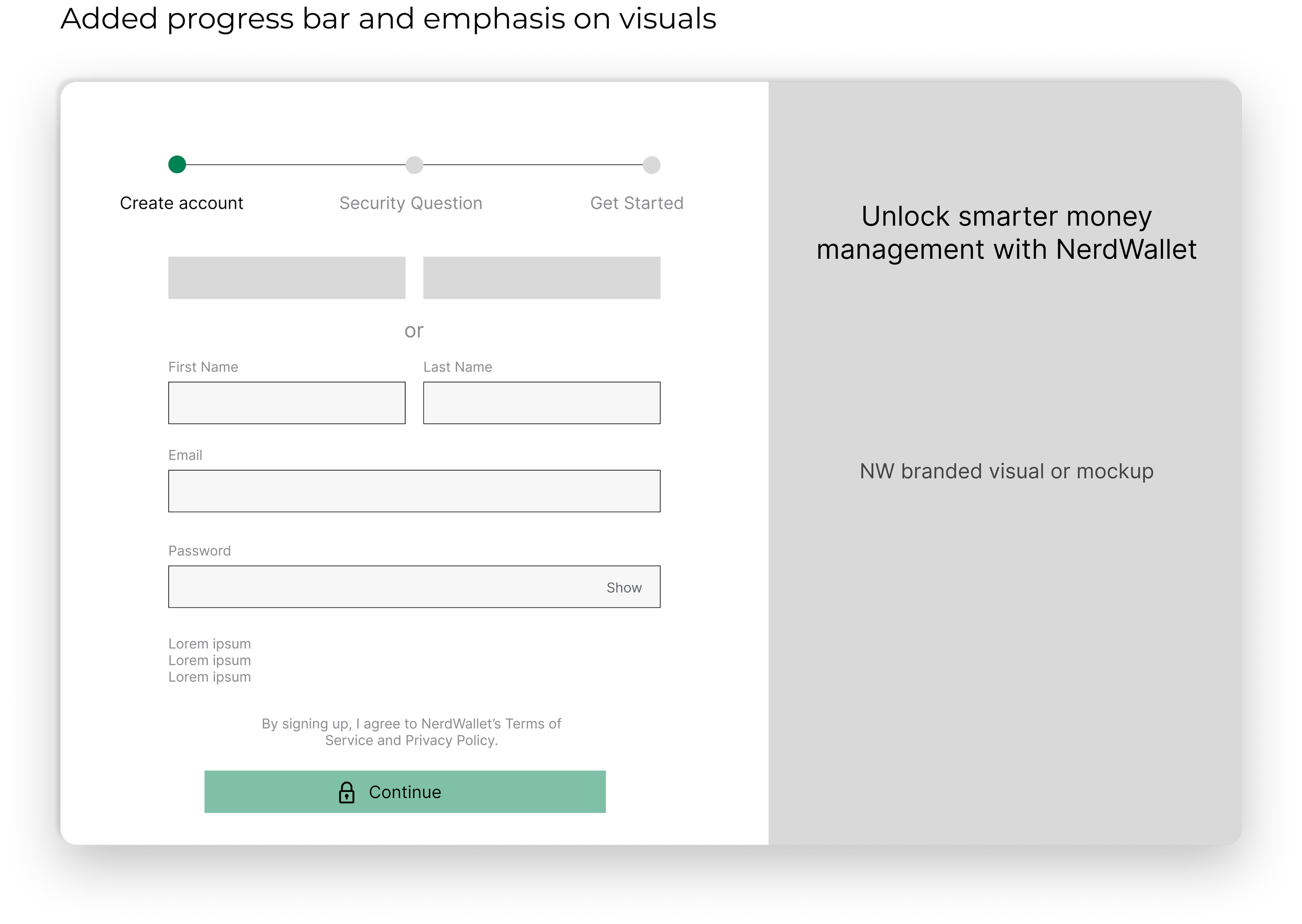
• Feels visually cluttered with 2 columns; image grabs attention
• Love the progress bar
User Insights
“I like that the progress bar clearly steps out what I will have to do to create an account. This sets my expectations up front before I start the account registration steps.”

Synthesizing feedback
After reviewing user feedback and discussing both design variations with the team, I merged their strongest elements. I retained the top-to-bottom flow for its clean, straightforward layout and integrated a progress bar to provide clear, step-by-step visibility. This approach balanced usability with our brand personality as I moved to higher-fidelity designs.
Iterating in High-Fidelity
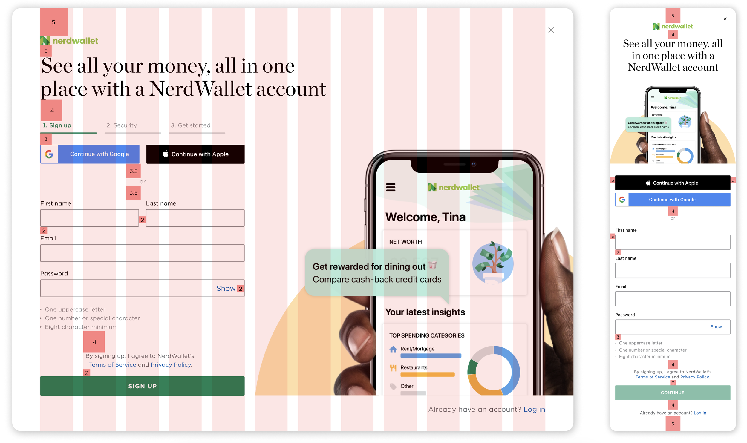
In Figma, I synthesized the best elements from both mockups into a responsive design for web and mobile.


Key design variations
VISUAL & BRANDING
Tested logo usage and varied branded imagery to bolster identity and trust
VALUE PROPOSITION
Tested copy to articulate benefits and drive relevance
PROGRESS BAR
Explored different styles to select the most visually compelling option
LAYOUT
Tested content density to minimize cognitive load and perceived effort
Maintaining design patterns
I leveraged NerdWallet’s grid, spacing, and typography standards to create high-fidelity mockups that ensured a consistent, clear, and cohesive user experience.
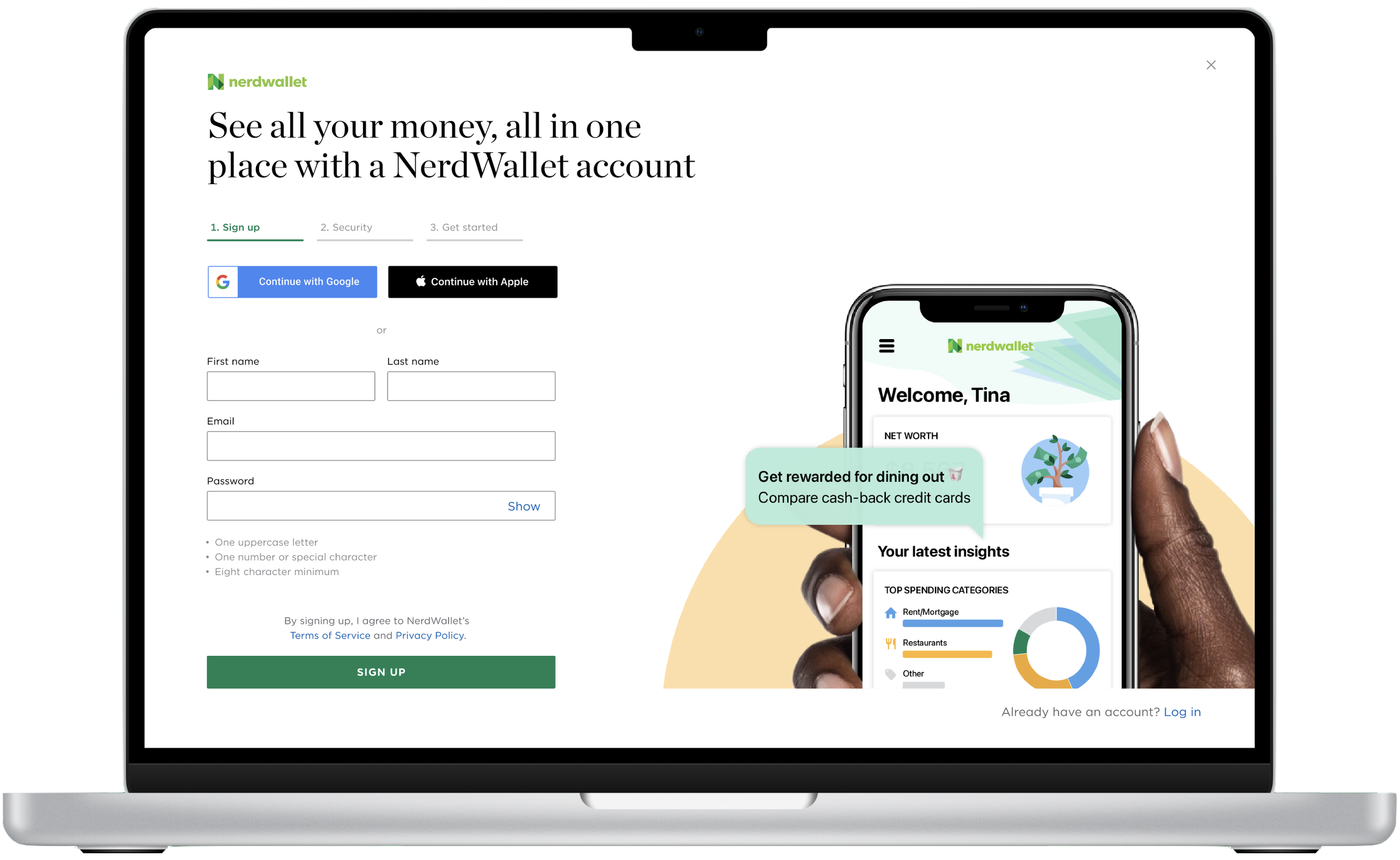
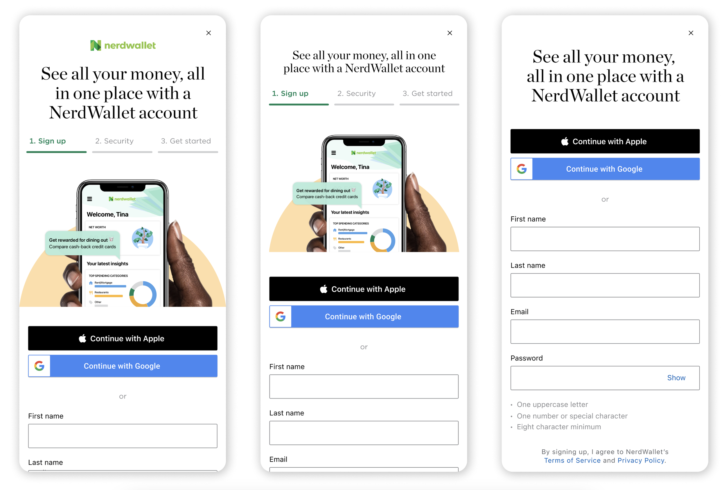
Launching the New 3-Screen Flow
After gathering feedback, I consolidated the best iterations into a streamlined 3-screen flow. The final step appears as a modal overlay on the dashboard, clearly separating account creation from onboarding. This design emphasizes that while onboarding is available, it’s entirely optional.
Measuring Impact
Post-launch analytics confirmed strong baseline improvements, with significant gains in account conversions and brand recognition during the initial test phase.
TIME-TO-COMPLETE
-3 min
MONTHLY NEW ACCOUNTS
+1000
BRAND RECALL
33%
75%
Post-Launch A/B Testing
I built desktop and mobile variations to evaluate key tradeoffs. On mobile, I compared a version with branded imagery and a prominent logo - reinforcing the brand but pushing the form fields lower - with a leaner variant that kept fields high for better usability.
My learnings
REFINING THE NARRATIVE
Regular design pitches taught me to craft clear, strategic stories that resonate with stakeholders, ensuring shared vision and buy-in throughout the process.
COMMITMENT TO THE USER
Regular design pitches taught me to craft clear, strategic stories that resonate with stakeholders, ensuring shared vision and buy-in throughout the process.
COLLABORATING CROSS-FUNCTIONALLY
User interviews and usability tests deepened my focus on consumer needs, driving iterations that directly address user and business challenges while delivering measurable impact.